
Why These Design Mistakes That Make Your Brand Look Unprofessional Hurt Trust
Design mistakes that make your brand look unprofessional are often small but costly. Most businesses lose trust not because of bad services, but because of poor design choices. You ever land on a website and feel off within two seconds… but can’t explain why?
Nothing is obviously broken. The content is there. The offer is clear. Still, something feels cheap.
That feeling is design.
And most businesses don’t realize they’re losing people because of design mistakes that make your brand look unprofessional. Not because their service is bad—but because their presentation quietly says, “this isn’t reliable.”
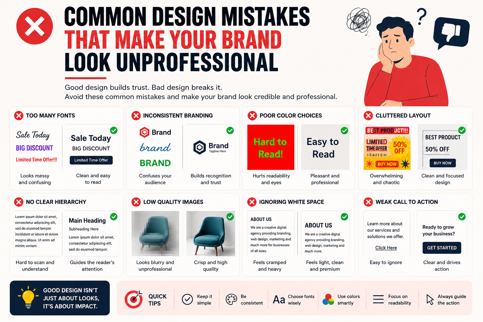
Trying to Show Everything at Once
There’s a phase every brand goes through. You want to prove you can do everything. So you add more—more colors, more elements, more text.
It feels productive. It looks… busy.
This is one of the most common design mistakes in branding. When everything is loud, nothing gets heard.
Imagine walking into a store where every shelf is packed and every sign is shouting. You don’t explore—you leave.
Design works the same way. Space isn’t emptiness. It’s control. Good design directly impacts conversions
Looking Like Five Different Brands
Your Instagram looks minimal. Your website looks colorful. Your posts look like experiments.
Individually, they’re fine. Together, they don’t match.
That disconnect is one of the easiest branding mistakes to avoid, yet most people ignore it. Because consistency feels boring when you’re creating.
But for the audience, consistency is comfort.
When things look familiar, people trust faster. When everything changes, it feels unstable.
Fonts That Try Too Hard
Fonts are like tone of voice. Subtle, but powerful.
And yet, people treat them like accessories—mixing 4–5 styles in one design.
That’s one of those unprofessional graphic design mistakes that instantly drops your credibility. Not because the fonts are bad—but because the choice feels careless.
A clean, readable font won’t impress anyone.
But it also won’t distract anyone.
And that’s exactly the point.
That “Something Feels Off” Layout
You’ve probably seen it. Nothing is aligned. Margins are inconsistent. Elements feel randomly placed.
You can’t explain it—but it feels messy.
These are the quiet design errors that hurt conversions. They don’t scream. They just slowly push people away.
Good alignment feels intentional. Bad alignment feels accidental.
People don’t trust accidents.
Random Colors With No Logic
Color is emotion. But most brands pick colors like they’re choosing outfits.
“Yeh achha lag raha hai.”
“Yeh thoda pop karega.”
Then everything starts clashing.
This becomes one of those poor visual branding mistakes that drains professionalism. Not because the colors are wrong—but because they don’t belong together.
A strong color system doesn’t just look good. It feels stable.
No Clear Next Step
This one is expensive.
You design a great post. Good visuals. Nice message.
But then… nothing.
No direction. No action.
This is one of the most common design mistakes in marketing materials. You got attention, but didn’t guide it.
It’s like inviting someone into a store and then disappearing.
People need direction. Subtle, but clear.
Websites That Feel Like Work
Some websites feel smooth. Others feel like an effort.
Scrolling becomes tiring. Information feels scattered. You keep thinking, “Where do I click?”
These are classic website design mistakes to avoid.
A good website feels like a conversation. You move naturally from one section to another.
A bad one feels like solving a puzzle.
And no one came to your website to solve puzzles. Users form first impressions of a website within seconds, as shown in UX research.
Copying Without Understanding
You see a trending design. It looks sharp. You recreate it.
It looks good—but something feels off.
Because it’s not yours.
This creates another layer of design mistakes that make your brand look unprofessional. It removes identity.
When everything starts looking the same, nothing stands out.
Your brand shouldn’t feel like a template. It should feel like a personality.
Overdesigning Simple Ideas
Sometimes, the message is already strong.
But instead of letting it breathe, you decorate it.
Add effects. Add elements. Add noise.
And suddenly, the clarity is gone.
These are subtle bad design examples in business—where effort increases but impact decreases.
Not everything needs styling. Some things just need space.
Forgetting Mobile Exists
Design looks perfect on the desktop. Then you check it on your phone.
Text cramped. Buttons small. Layout broken.
This is one of those design errors that hurt conversions in a very real way. Because most people are not seeing your desktop version.
If it doesn’t work on mobile, it doesn’t work. Most design mistakes that make your brand look unprofessional happen because of inconsistency and poor visual decisions.
Conclusion
Most design problems are not dramatic. They’re small, repeated, and easy to ignore.
But together, they create a feeling.
And that feeling decides whether someone trusts you—or moves on.
Avoiding these design mistakes that make your brand look unprofessional isn’t about being perfect. It’s about being intentional.
Less noise. More clarity.
Less randomness. More consistency.
Because people don’t always remember what you said.
But they always remember how it felt.
FAQs
1. What are the most common design mistakes in branding?
Inconsistency, clutter, poor alignment, and unclear direction are the biggest ones.
2. How do design mistakes affect conversions?
They create hesitation. And hesitation reduces action.
3. Can fixing small design issues improve results?
Yes. Small improvements often create noticeable changes in engagement and clicks.
4. Why does consistency matter so much?
Because familiarity builds trust. And trust drives decisions.
5. How do I know if my design feels unprofessional?
If it looks inconsistent, crowded, or confusing—it’s already affecting perception.