The Psychology Behind High-Converting Visual Design
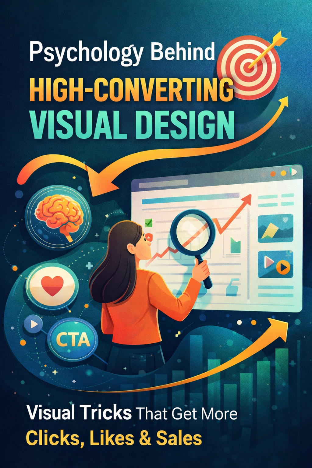
The Psychology Behind High-Converting Visual Design is not about making things look good. It’s about understanding how people think, react, and make decisions in seconds. Let’s be honest.
Most people don’t scroll Instagram thinking, “Wow, what a beautiful kerning adjustment.”
They stop because something hits.
Something feels easy. Clear. Interesting. Maybe even a little addictive.
That’s where the Psychology Behind High-Converting Visual Design starts. Not in tools. Not in trends. But in how people think, feel, and decide in milliseconds.
You don’t need to make things prettier.
You need to make people act.
Key Elements of Psychology Behind High-Converting Visual Design
You might spend 2 hours designing a post.
User spends 1.5 seconds deciding whether to stay.
Brutal, but true.
So the question isn’t: “Is my design good?” The real question: “Does my design stop the scroll?” That’s the core of attention-driven design.
If your visual doesn’t create an immediate pause, everything else—message, CTA, value—dies right there.
The Brain is Lazy (Use That)
The human brain is wired for survival, not appreciation.
It constantly asks:
- Is this easy?
- Is this useful?
- Is this worth my time?
If your design makes the brain work harder than necessary → user leaves.
This is where cognitive load design comes in.
Example:
You open a post:
- Too many colors
- 5 fonts
- No clear focus
Brain says: “Too much effort” → scroll.
Now compare:
- One headline
- One visual
- One message
Brain says: “Easy” → stays.
Simple wins. Always.
Clarity Beats Creativity (Every Time)
Designers often chase uniqueness.
Users just want clarity.
You can create the most creative layout in the world…
but if user doesn’t understand it instantly, it fails.
That’s the uncomfortable truth behind the Psychology Behind High-Converting Visual Design.
Think like this:
Not “How creative can I get?”
But “How fast can they understand?”
Visual Hierarchy = Silent Communication
Users don’t read line by line.
They scan.
So your design needs to guide their eyes without them realizing it.
That’s layout psychology.
The flow should be:
- Headline grabs attention
- Visual supports message
- Supporting text builds meaning
- CTA tells what to do
If everything screams equally → nothing is heard.
Emotion Sells Faster Than Logic
People don’t buy products.
They buy feelings.
That’s where emotional design strategy becomes powerful.
Example:
Two posts:
Post A:
“High quality product. Best features.”
Post B:
“Finally, something that actually works.”
Which one feels relatable?
Emotion reduces resistance.
Logic justifies later.
Trust is Invisible but Critical
No trust = no conversion.
Even if your design looks good.
That’s where trust-building design matters.
Subtle trust signals:
- Clean spacing
- Consistent colors
- Professional typography
- No visual clutter
Messy design = unreliable feeling
Clean design = confidence
A user might not say it out loud, but their brain notices. .
Call to Action: The Missing Piece
Many designs look good but don’t convert.
Why?
No direction.
This is where call-to-action design comes in.
You can’t expect users to guess what to do next.
Weak CTA:
“Learn more”
Strong CTA:
“Try this now.”
“Fix your design today.”
Clarity + urgency = action
Why Some Posts Go Viral (And Others Die)
Ever noticed how some reels just explode?
It’s not luck.
It’s psychology.
Understanding the Psychology Behind High-Converting Visual Design helps answer one big question:
How to make reels go viral
Not by adding effects.
But by controlling attention.
Viral design patterns:
- Strong first frame
- Clear message
- Emotional hook
- Easy to consume
If the user understands your reel without sound → you’re doing it right.
The “Effort vs Reward” Equation
User subconsciously calculates: “What do I get vs how much effort I give? if effort is high → skipIf reward is high → stay
Your job is to:
- Reduce effort
- Increase clarity
That’s conversion design in one line.
The Myth of “More is Better”
More elements ≠ , more value
Actually:
More elements = more confusion
Minimal design is not about space.
It’s about removing what doesn’t matter.
Real Example (Think About This)
Imagine two Instagram posts:
Post 1:
- Bright colors
- 10 elements
- Fancy effects
Post 2:
- White background
- One bold line
- One clear visual
Which one feels easier?
Which one would you actually stop for?
That’s the Psychology Behind High-Converting Visual Design in action.
The “First Glance Rule”
If the user can’t understand your design in 1 second → redesign it.
Yes, it’s that strict.
Because attention is expensive now.
Attention is the New Currency
Not followers.
Not likes.
Attention.
And attention is earned through:
- Simplicity
- Clarity
- Relevance
That’s the foundation of attention-driven design.
Design for Humans, Not Designers
Designers often try to impress other designers.
Users don’t care.
They care about:
- “Can I understand this?”
- “Is this useful?”
That’s it.
One Big Shift You Need
Stop thinking: “How can I design this? Start thinking: “How will they see this?”
That shift alone changes everything.
Putting It All Together
To apply the Psychology Behind High-Converting Visual Design, your design should:
- Grab attention instantly
- Reduce thinking effort
- Guide the eye naturally
- Trigger emotion
- Build trust
- Give clear direction
If even one of these is missing → conversion drops.
Final Thought
Good design looks nice.
High-converting design works.
And the difference?
Psychology.
Not tools. Not trends. Not luck.
Just understanding how people think, feel, and decide.
The Psychology Behind High-Converting Visual Design is not a trend, it’s a system that turns attention into action.
One-line takeaway:
If your design makes people think less and feel more, it will always perform better.