Principles of Graphic Design for Freelancers Entering Professional Work
Principles of graphic design are the foundation of every professional visual layout. Without understanding balance, contrast, hierarchy, and spacing, even good ideas fail to communicate clearly. Learning design independently gives you speed, curiosity, and flexibility. What it doesn’t always give you is structure. That gap becomes visible the moment client work starts—when decisions need explanation, not just execution. This is where the principles of graphic design matter.
They don’t exist for theory lovers. They exist so your work holds up in real situations: feedback rounds, tight deadlines, and conversations with people who judge results, not effort.
Principles of Graphic Design: Balance and Visual Hierarchy?
Because practice allows intuition. Client work demands reasoning.
When a layout feels right but you can’t explain why, confidence drops. Clients—whether they’re Content creators, Small business owners, Social media managers, or Marketing interns—aren’t testing your taste. They’re testing clarity.
Design principles turn instinct into logic. Logic builds trust.
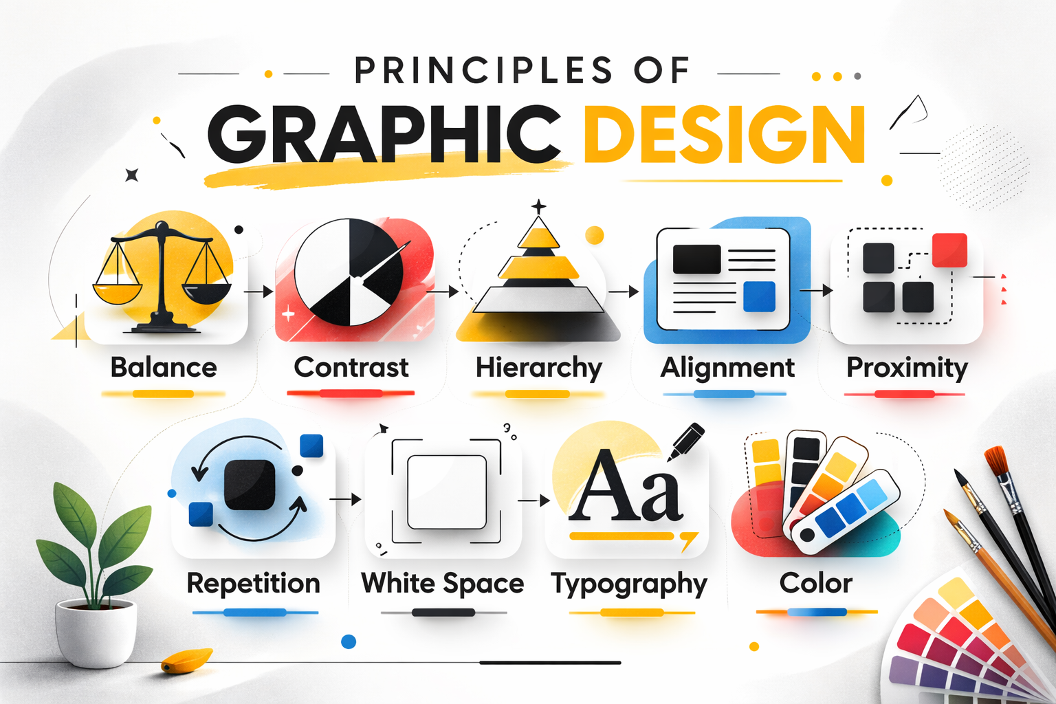
Balance: stability vs energy
Balance controls how visual weight is distributed. Symmetry feels safe and predictable. Asymmetry feels active and modern. Both work when used intentionally.
In professional projects, balance prevents visual tension that distracts from the message.
-
Businesses lean toward balanced layouts for trust
-
Digital platforms often benefit from controlled asymmetry
-
Campaign work demands flexibility based on context
Balance is not a style choice. It’s a structural one.
Contrast: making priorities obvious
Contrast decides what gets noticed first. Size, color, spacing, and weight all contribute. Without contrast, everything blends together and nothing stands out.
Clear contrast improves readability and decision-making, especially in fast-moving digital environments.
Strong contrast isn’t loud. It’s precise.
Visual hierarchy: guiding attention
Every design answers a simple question: where should the eye go first?
Hierarchy organizes content so viewers don’t have to work. Headlines lead, supporting information follows, details come last. When hierarchy is weak, users disengage. You can also explore our branding and visual identity work to see these principles applied in real projects.
Professional design removes friction by design.
Alignment: discipline that shows
Alignment is subtle, but its absence is obvious.
Consistent alignment makes layouts feel intentional. Inconsistent alignment feels accidental. Most early-stage designers see immediate improvement just by fixing alignment.
Order communicates professionalism without saying a word.
Proximity: structure through spacing
Proximity groups related elements and separates unrelated ones. It reduces confusion without adding visual clutter.
Instead of adding boxes or lines, spacing often solves the problem more cleanly. White space does the explaining.
Repetition: consistency builds trust
Repetition creates recognition. Using the same fonts, colors, and layout patterns helps users feel familiar with a brand.
Consistency isn’t boring—it’s reliable. Reliable design scales across platforms and formats. Many of these concepts align with standard visual design fundamentals discussed in professional design education.
White space: clarity, not emptiness
White space improves focus and readability. Crowded designs feel anxious. Spacious designs feel confident.
Restraint signals control. Control signals experience.
Typography: tone before meaning
Fonts communicate before words are read. Typography sets mood, credibility, and clarity.
Good typography prioritizes legibility first, personality second. Poor type choices undermine even strong content.
Color: emotion with intention
Color influences emotion instantly. Limiting palettes improves focus and recognition. Strategy matters more than variety.
Color should support the message, not compete with it.
Why principles change professional conversations
Clients don’t pay for opinions. They pay for decisions.
When design choices are explained through principles, feedback becomes faster and clearer. Revisions reduce. Confidence increases. This is how professional studios operate—logic first, visuals second—something you’ll notice when observing established design practices referenced across serious portfolios like those indirectly reflected on visoradesign.in.
FAQs
Are principles more important than tools?
Yes. Tools execute decisions. Principles create them.
Can beginners apply principles immediately?
Yes. Even basic application improves clarity and confidence.
Is breaking design rules acceptable?
Only after understanding why they exist.
Do clients care about theory?
They care about outcomes. Principles improve outcomes.
Final thought
Professional design isn’t louder creativity. It’s clearer thinking.
The principles of graphic design replace guesswork with structure. Tools help you work faster. Principles help you work smarter. That difference is what separates practice from profession.